Color: From Boring to Brilliant! | Instructor, Patti Mollica ©Patti Mollica
HOMEWORK ASSIGMENT Lesson 2: Working within a color Scheme
The goal of this exercise is to learn how to "stretch" colors to create variety and interest, and implement the same variety of colors in a color scheme.
Assignment 1. Color Chart
Create a grid of squares approx. 1”x1” on a canvasboard or panel - approx. 8x10 or larger such as 11x14 will yield more squares.
Pick a color, any color - “stretch it” to make it interesting!
Create a chart that shows as many variations of that chosen color as you can make - keeping in mind the 3 characteristics of color - Hue, Value and Saturation.
Hue : Your color will veer off into analogous - but don’t go to the opposite side of the color wheel. i.e if you pick Red, don’t create Blues or Greens, etc. Use any or every color you want to mix into the red to create these Red variations but make sure that the color stays in the Red family - not the family of the color you are mixing into it. (Red is just an example - use any color)
Value: Make sure your chart has a range of values - SQUINT! or take a picture with your cell phone and put a “mono” filter on it which changes the color to b/w/grey. Make sure you have value variety.
Saturation: Include both saturated versions of your color and muted versions of your color in your chart
Assignment 2: Create a painting that uses the colors created in the chart. Your painting should incorporate most or all of the colors in your chart. Hint: your painting and your chart should look similar. If your chart is far more colorful than your painting, keep adding chart colors till they look more similar.
Do the same “cell phone” value check when working on a painting. Take a “mono” picture of your painting and compare to the b/w reference photo. Check to see you are matching the dark, middle and light values of the reference image.
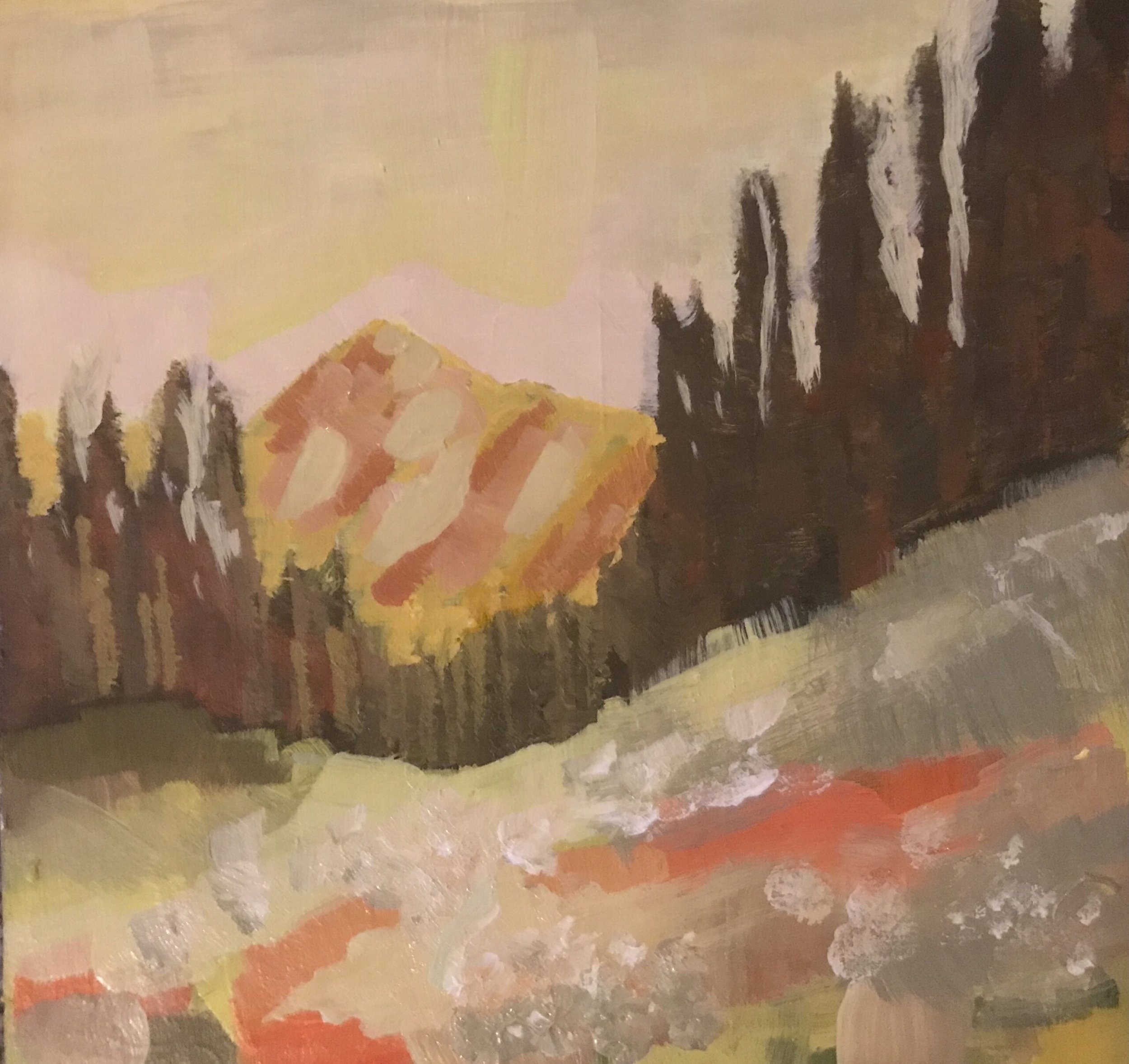
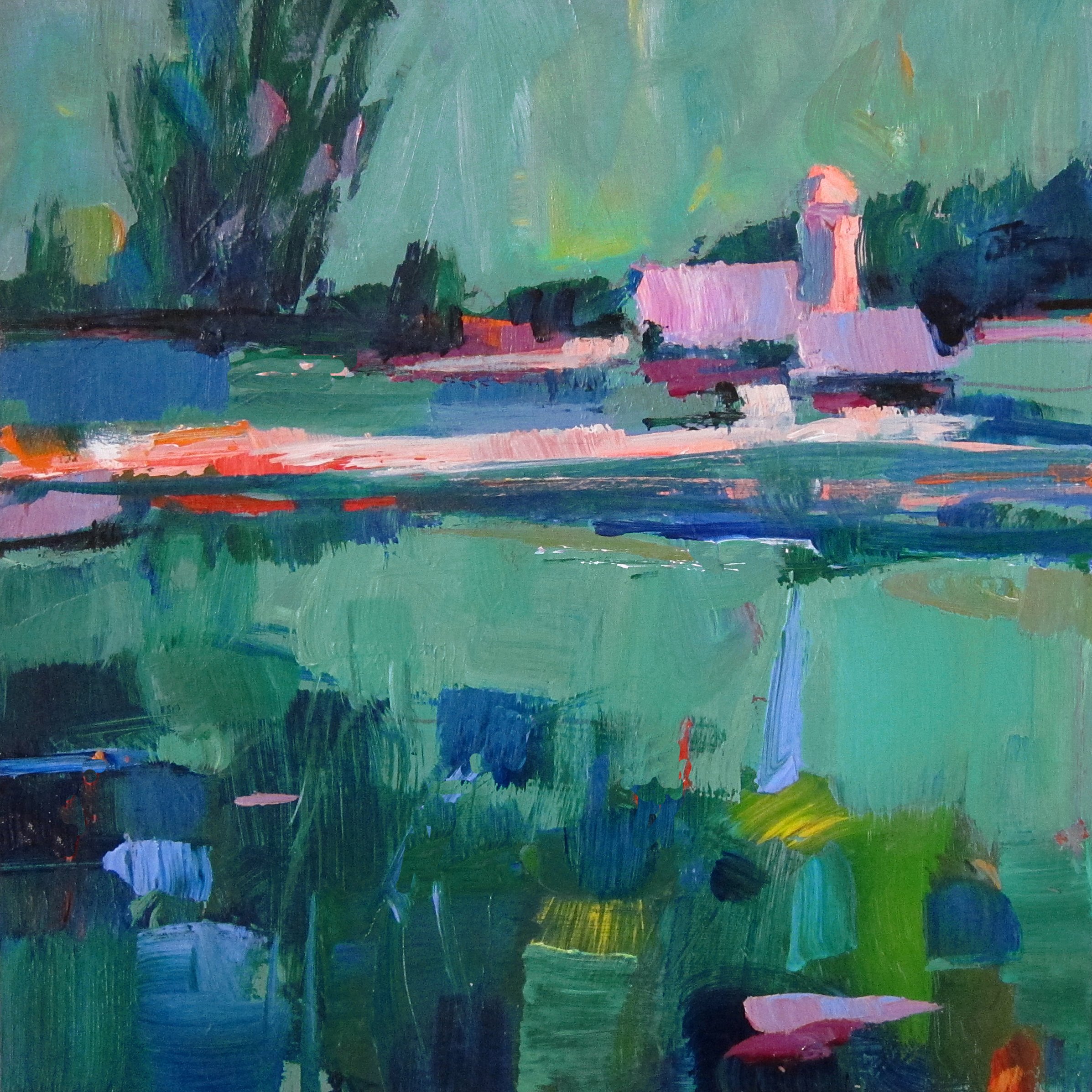
Student examples below:
Use Week 1 reference photos or this week’s additional photos (below)
If your colors don’t seem to be playing well together,
add a bit of the other color(s) into your mixtures, as you did in the color chart exercise
mix in a Mother Color, and incorporate into your mixtures so all the colors relate
Above is an example of an analogous complimentary color scheme using blues, blue-greens and greens - plus red, the complement. Notice that cool colors are the dominant colors and reds the less dominant.
A harmonious mood is created when one color temperature is dominant, the other color temperature is used more sparingly.
Also notice the variety - there are warm and cool greens, warm and cool reds. That makes the colors more interesting.
While you are painting, keep the BW photo in front of you. Try to match the tonal values to your colors. I.e. where the photo is dark, use dark colors, where light, use light colors, etc. You can create as many paintings in color schemes as you wish. If you want, take liberty with the image - abstract or modify as you see fit.
To see the color mixtures and possiblities that will result from intermixing your limited color scheme palette, OR if you want to try a more expansive palette with a mother color(s) added, try mixing colors in an abstract random way - explore the results of those color combinations before committing to a painting - see what you get!
Assignment 3: Pick one Mother Color for your painting.
Do a painting from any of my reference photos with your entire palette of colors and pick 1 mother color
add a bit of it to every color mixture in your painting. Your one mother color could be any color you choose. It could also be one or several colored greys from Homework 1.
If you chooes a dark color like purple, it will darken your light value colors - like yellow. So mix a a batch of middle value and a light value bviolet too, to add to other colors (of the same value) so that you maintain their value.
When posting to FB, indicate which mother color was used in your painting.
Teal on left, added to the 4 colors to harmonize.
Assignment 4: Use only 3 or 4 colors + white to create a painting from the reference photos provided.
You can use any colors you wish. If you are not sure what to pick, here is a random suggestion: Yellow-orange, Blue and Violet. This is a split complementary color scheme. Choose whether the dominant temperature will be warm or cool.
Yellow-orange is a mixture of orange and yellow. For the violet you can use Dioxozine purple, or mix a violet from Ultramarine blue and Magenta. Your blue can be Thalo blue or a less intense blue like Cerrulean Blue or Manganese blue which is lighter and less intense. Be forewarned that if you are using Thalo blue, it is powerful - a little goes a long way and it will tend to “overpower” your other colors.
Use these 3 colors - or any three colors that you choose - plus white and black to do your entire painting. It’s a good idea to write down the colors you chose on the back of your painting for future reference. Post the colors you used on your FB post.
Shown above is the reference photos and painting that resulted using a limited palette of 4 colors: Violet, Green, Ochre and Alizarin (plus b/w). I chose 4 colors that actually relate to the colors in the photo.I worked from a color photo since my goal was to maintain the realistic colors. If it is your intention to keep the realism, pick colors that make sense. Notice the sky color. Since there was no blue paint, I had to make due with the colors at hand. It works because it harmonizes.
Additional suggestions:
Glazing: If you have already finished your painting but it still lacks harmony, you can glaze the whole canvas with a color that adds a specific mood. This reduces the intensity of the colours but links the elements together. Think of it as a little bit like adding a tinted glass over a scene to make it look sunnier, mistier or darker. For acrylics: I use a glazing medium because it has binder in it. (water has no binder). For oils, use an oil painting medium which dries clear and has binder.
Underpainting: Tone the canvas a color and let bits and pieces show thru. You pick the color! Here is an interesting article on toning the canvas, ideas and suggestions….
Andrew Loomis’s thoughts on color unification, excerpts taken from his book “Creative Illustration”
Have fun and enjoy!


