Color: From Boring to Brilliant! | Instructor, Patti Mollica ©Patti Mollica
Homework assigment Week 2: Working with Color Schemes, Mother Colors and Limited Palette
Assignment 1: The goal in this exercise is to work in color schemes using a wide variety of colors - but generally staying within the chosen scheme.
Choose a color scheme you want to work in. Pick your subject from the reference photos. Use a wide variety of colors to interpret the B/W photo into a painting that fits within a color scheme. You can have colors that “don’t fit” the scheme, however they need to be small accents rather than large areas of color.
You will be using your entire palette of colors, whatever colors you wish. Many colors from my palette were used in the example below. When applying color to an area - i.e. green, try to come up with as many greens as you can to use in your green area.
It is helpful to work from b/w photo when changing the realistic colors to color schemes of my choice. You can also create a chart of color variations before starting a painting.
This chart shows a variety of greens using a variety of colors. Try not to mix just ONE color (i.e.. Viridian green) and use that one tube color throughout. This will require you to mix colors that you might never normally mix into greens. Adding red will neutralize it, adding blue will cool it, adding yellow will lighten and brighten it. Adding orange will give it an organic feel, as will brown. Come up with as many variations of your color as possible. This variety is all for the sake of visual interest.
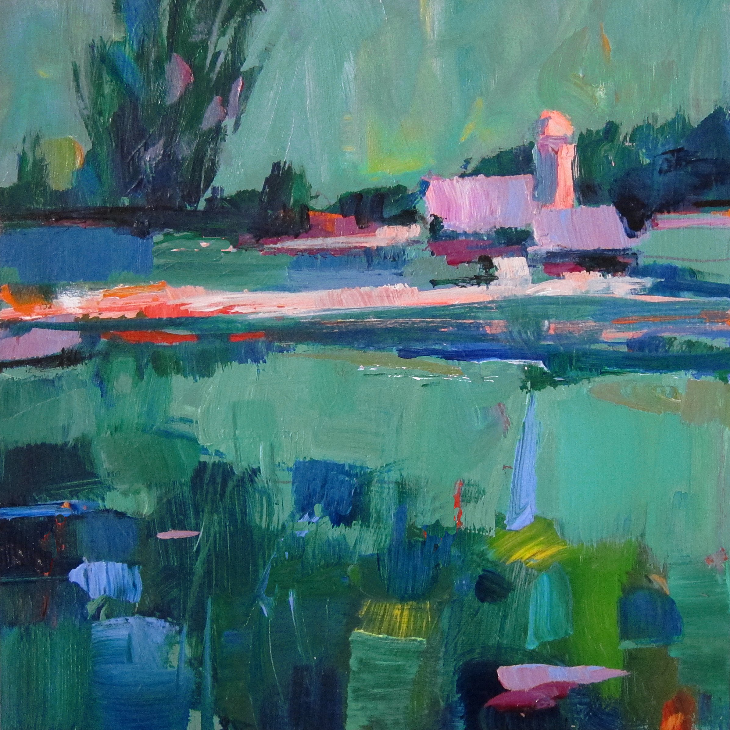
Shown below is an example of an analogous complimentary color scheme. The colors I used are blues and greens plus red. Notice that blue-greens are the dominant colors and reds the less dominant and focal point color. It often creates a unified mood when one color temperature is dominant, the opposite color temperature is used more sparingly.
Also notice the variety and temperature - there are warm and cool greens, warm and cool reds. That makes it more interesting to the viewer.
If your colors don’t seem to be working well together, add a bit of the other color(s) into your mixtures, as you did in the color chart exercise.
If you feel your colors are not unified enough, mix in some Mother Colors (from Homework 1), and incorporate them in your mixtures so all the colors relate. You can also tone the canvas a color and let bits and pieces show thru. You pick the color.
If you can, try to give the painting a more interesting effect than just applying one uniform color which is a more “graphic effect”. If that is beyond your skill level, just work in whatever way is comfortable, in order to stay within the color scheme.
While you are painting, keep the BW photo in front of you. Try to match the tonal values to your colors. I.e. where the photo is dark, use dark colors, where light, use light colors, etc.You can create as many paintings in color schemes as you wish. If you want, take liberty with the image - abstract or modify as you see fit.
If you want to see what color mixtures and possiblities will result from intermixing your limited color scheme palette, OR if you want to try a more expansive palette with a mother color(s) added, try mixing colors in an abstract random way - explore the results of those color combinations before committing to a painting - see what you get!
Assignment 2: Use a Mother Color in your painting
Do a painting from any of my reference photos with your entire palette of colors and pick 1 mother color and add a bit of it to every color you place on your palette.
Your one mother color could be any color you choose. It could also be one or several colored greys from Homework 1.
If you chooes a dark color like purple, it will darken your light value colors like yellow, so mix a a batch of middle and a light violet too, to add to other colors of the same value so that you maintain their value.
Assignment 3: Use only 3 colors + white to create a painting from the reference photos provided.
If you are not sure what to pick, here is a random suggestion: Yellow-orange, Blue and Violet. This is a split complementary color scheme. Choose whether the dominant temperature will be warm or cool.
Yellow-orange is a mixture of orange and yellow. For the violet you can use Dioxozine purple, or mix a violet from Ultramarine blue and Magenta. Your blue can be Thalo blue or a less intense blue like Cerrulean Blue or Manganese blue which is lighter and less intense. Be forewarned that if you are using Thalo blue, it is powerful - a little goes a long way and it will tend to “overpower” your other colors.
Use these 3 colors - or any three colors that you choose - plus white to do your entire painting. It’s a good idea to write down the colors you chose on the back of your painting for future reference. Post the colors you used on your FB post.
Click below for reference photos. Working from b/w images can make it easier to depart from realistic colors.


